Volcanica Coffee Website
Transforming a premium coffee retailer's digital presence to match the quality of their product and reclaim direct customer relationships.
Redirecting
Revenue
An outdated interface and strategic missteps were funneling customers to Amazon instead of converting them on-site.
Volcanica Coffee sourced beans from the world's most elite farms, but their website didn't reflect that caliber. Despite offering premium, specialty coffee unavailable anywhere else, their highest sales came through Amazon—not their own site. The stakeholder needed us to apply best-in-class e-commerce practices, reduce drop-offs, and shift revenue back to their direct channel. The outdated UI and chaotic navigation created friction at every turn, but we needed data to pinpoint exactly where users were abandoning their journey and why.
Our team conducted a comprehensive site audit to map the user experience from landing page to checkout. The findings were clear: users felt paralyzed by choice. With hundreds of coffee varieties and no clear filtering or recommendation system, visitors didn't know where to start. Product cards lacked visual hierarchy—origin, roast level, tasting notes, and price all competed for attention with equal weight. Product pages buried critical information below the fold while prominently featuring Amazon purchase buttons, literally directing customers off-site. This dual-channel approach wasn't just losing immediate sales—it was training customers to bypass Volcanica entirely, costing them marketplace fees and limiting their catalog to only what Amazon stocked. We then performed a competitive audit, analyzing successful specialty e-commerce sites and luxury retail experiences to identify patterns in navigation, product presentation, and trust-building elements.
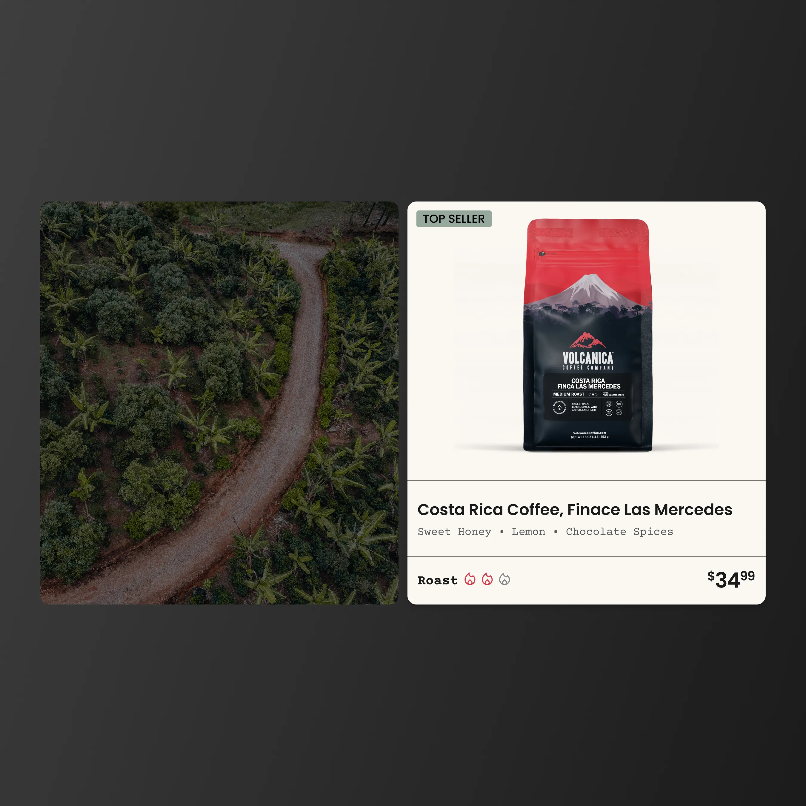
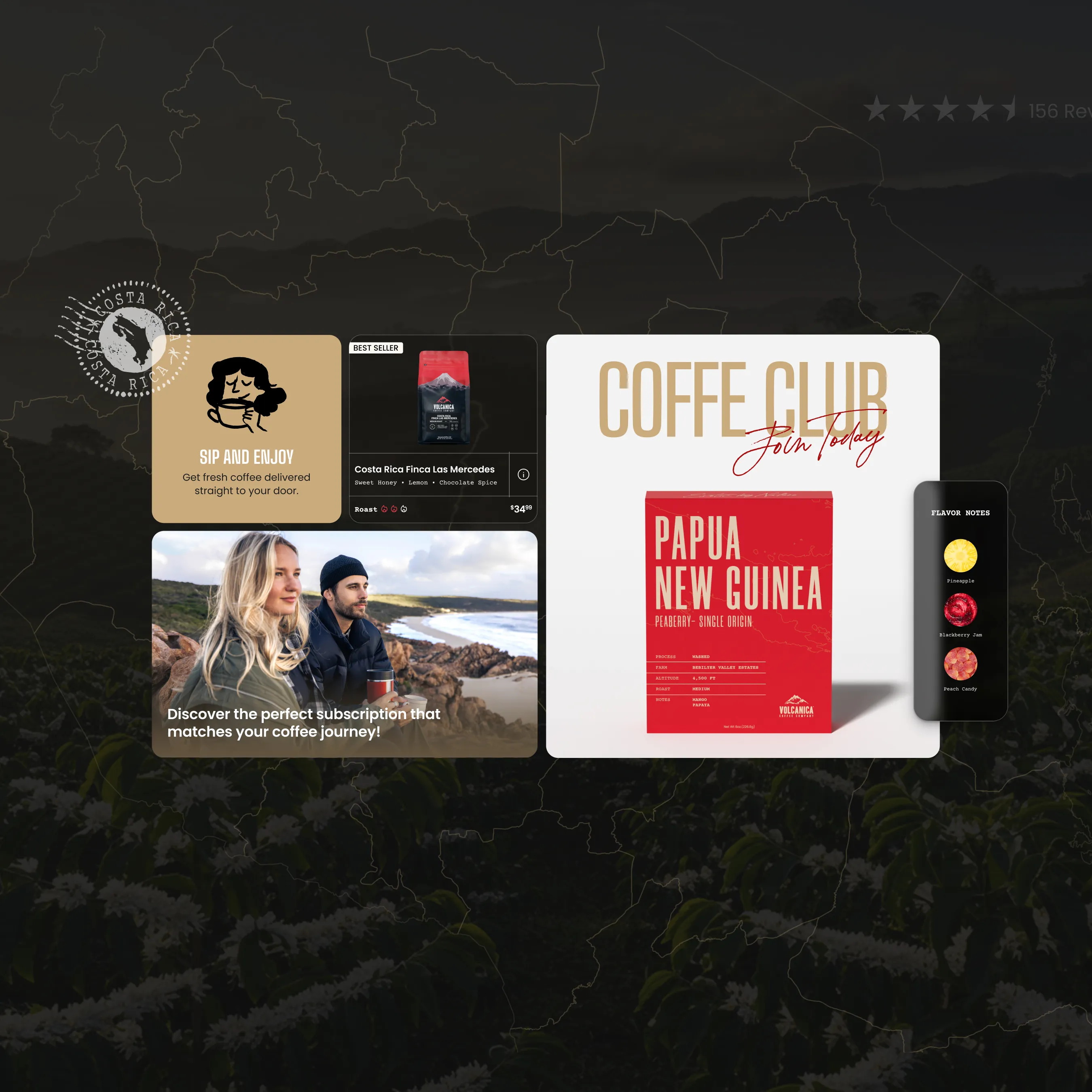
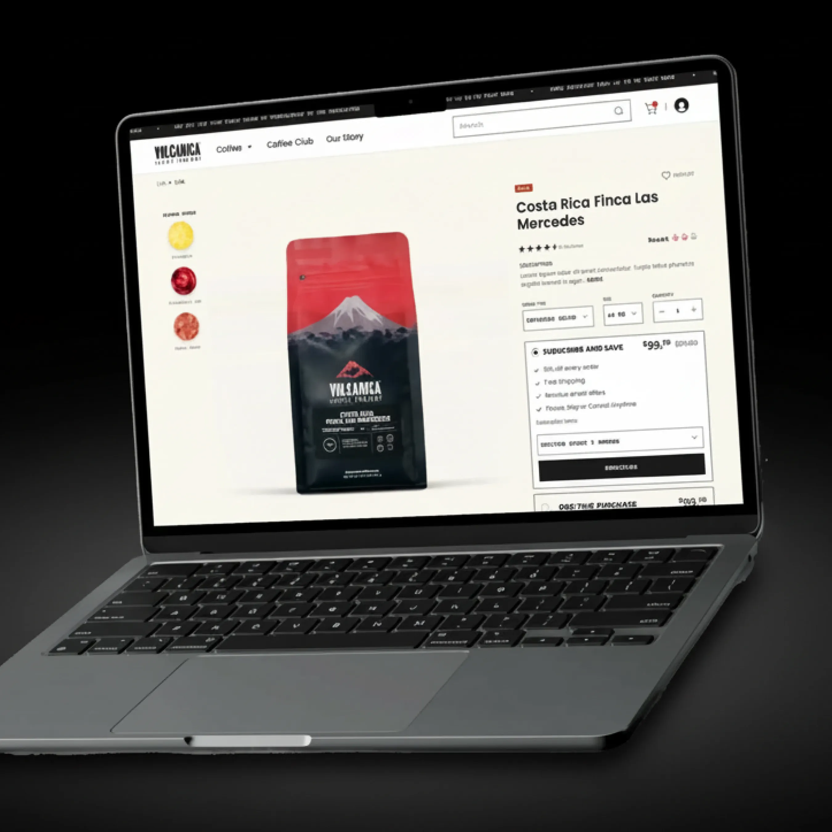
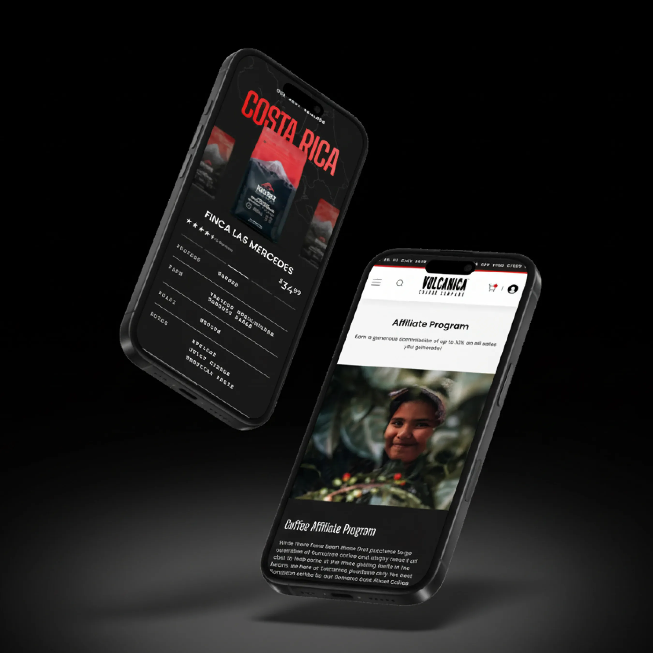
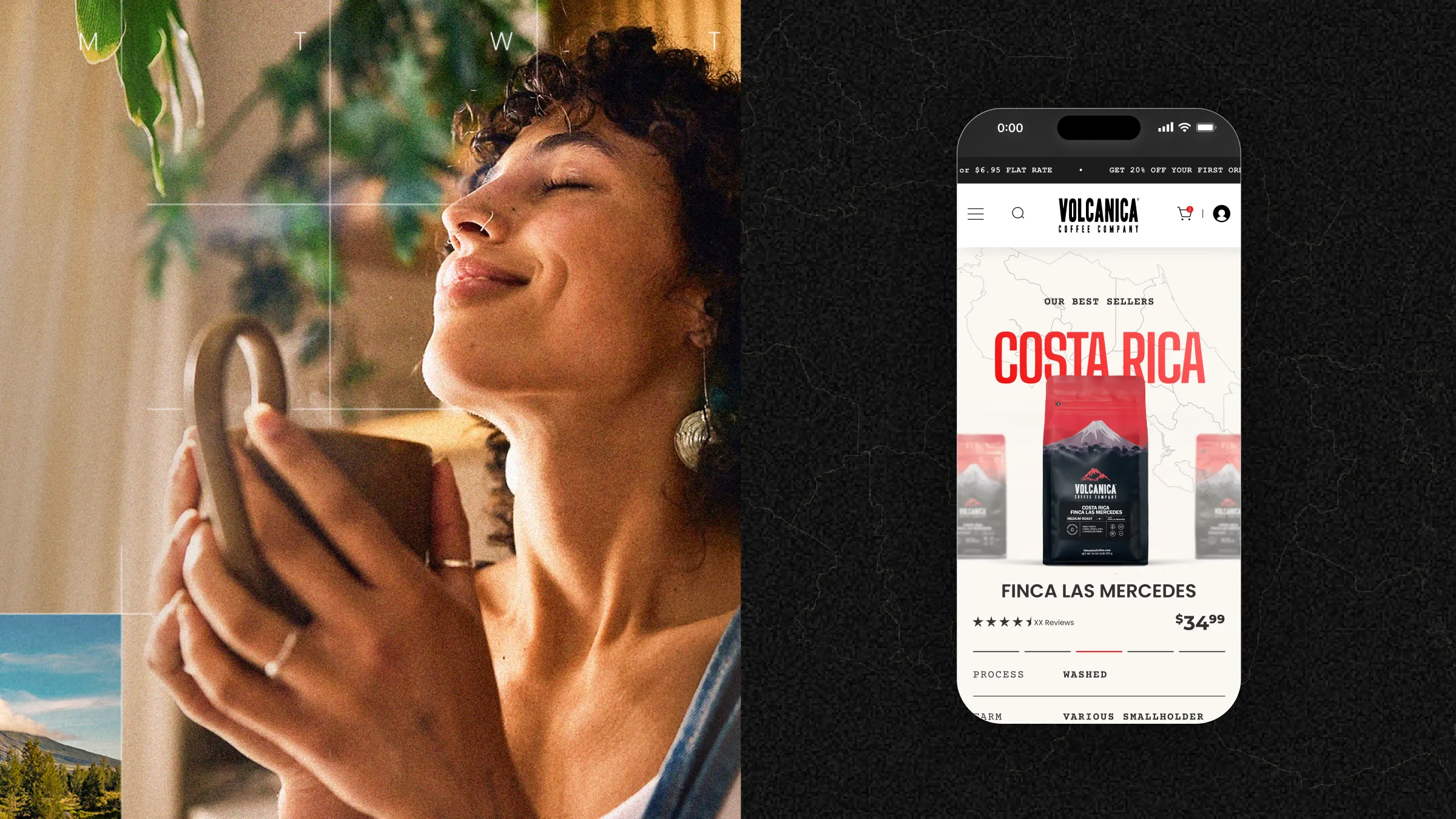
The redesign elevated every touchpoint. We restructured the information architecture with intuitive filtering by roast level, origin, flavor profile, and brewing method, allowing users to narrow options without feeling overwhelmed. Our team introduced a guided discovery flow for new visitors and streamlined product cards with clear visual hierarchy—hero imagery, bold origin labels, and concise flavor descriptors. Product pages were rebuilt with persuasive copywriting, detailed sourcing stories, and high-quality photography that communicated luxury and craftsmanship. We removed external purchase links entirely, making the path to checkout frictionless and keeping users within the Volcanica ecosystem. The design system we established used rich earth tones, elegant typography, and spacious layouts that matched the premium positioning the brand deserved. The results validated our approach: direct website purchases increased by 35%, reducing reliance on Amazon and giving Volcanica full control over their customer relationships and profit margins.

